In the ever-evolving landscape of web design, the importance of structure and organization cannot be overstated. A well-structured website not only enhances user experience but also ensures that content is presented in a visually appealing and accessible manner. One of the most effective ways to achieve this is through the use of grid layouts. Grids provide a framework that brings balance, order, and visual hierarchy to any design, allowing designers to create cohesive and functional web pages. In this blog post, we will explore the essentials of using grid layouts in web design, their benefits, and practical tips for mastering them.
Understanding Grids in Web Design
A grid is a system of intersecting horizontal and vertical lines that help to organize content within a layout. By dividing a web page into sections, grids enable designers to create a sense of order and alignment. They serve as a guide for placing elements such as images, text, and buttons, ensuring that everything is visually cohesive.

Types of Grids
There are several types of grids commonly used in web design:
- Column Grids: These grids are divided into vertical columns, which can vary in number and width. Column grids are particularly useful for responsive design, as they can easily adapt to different screen sizes.
- Modular Grids: These grids consist of both vertical and horizontal divisions, creating modules or “cells” that can hold content. Modular grids are ideal for complex layouts, as they provide a high degree of flexibility.
- Hierarchical Grids: These grids prioritize certain elements over others, allowing designers to create a visual hierarchy. Hierarchical grids are often used in editorial designs, where certain pieces of content need to stand out.
- Baseline Grids: A baseline grid aligns text across columns, ensuring consistent spacing and readability. This type of grid is particularly important for typography-heavy designs.
The Benefits of Using Grids
1. Improved Organization
Grids provide a clear structure for organizing content, making it easier for users to navigate a website. By aligning elements along a grid, designers can create a sense of order that guides the viewer’s eye through the page.
2. Enhanced Visual Hierarchy
Grids help establish a visual hierarchy by allowing designers to emphasize certain elements over others. By adjusting the size, position, and spacing of elements within the grid, designers can draw attention to key information and create a more engaging user experience.
3. Consistency and Cohesion
Using a grid system promotes consistency across web pages. When designers adhere to a grid, they create a cohesive look and feel that enhances brand identity. Consistency in layout also helps users become familiar with the website, making it easier for them to navigate.
4. Responsive Design
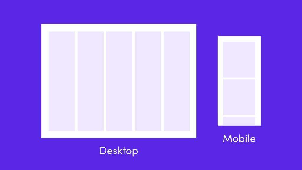
Grids are inherently flexible, making them ideal for responsive web design. By using a grid system, designers can create layouts that adapt to different screen sizes, ensuring a seamless experience for users on desktops, tablets, and smartphones.
5. Faster Design Process
Working within a grid system can streamline the design process. Grids provide a framework that allows designers to focus on content and aesthetics without getting bogged down by layout decisions. This efficiency can lead to quicker turnaround times for projects.
Mastering Grid Layouts: Practical Tips
Now that we understand the importance of grids in web design, let’s explore some practical tips for mastering grid layouts.
1. Choose the Right Grid System
Before you start designing, choose a grid system that suits your project. Consider factors such as the type of content you’ll be displaying, the target audience, and the overall aesthetic you want to achieve. Popular grid systems include:
- Bootstrap: A responsive grid system that allows for easy customization.
- CSS Grid Layout: A powerful layout system built into CSS that provides flexibility and control over grid design.
- Flexbox: While not a grid system per se, Flexbox can be used to create responsive layouts that adapt to various screen sizes.
2. Define a Clear Hierarchy
Establish a clear visual hierarchy by varying the size, weight, and color of elements within the grid. Use larger fonts for headings, bolder colors for important buttons, and ample white space to separate sections. This will help guide users through your content and ensure that they focus on what matters most.
3. Embrace White Space
White space, or negative space, is the area between elements in a design. It plays a crucial role in enhancing readability and creating a balanced layout. When using a grid, don’t be afraid to embrace white space; it can help prevent a cluttered appearance and allow your content to breathe.
4. Utilize Responsive Design Techniques
As mentioned earlier, grids are excellent for responsive design. Use media queries to adjust your grid layout based on different screen sizes. For example, you might have a three-column layout on desktop devices that collapses into a single column on mobile


